From 2 numeric variables
A lollipop plot is very close from both scatterplots and barplots.
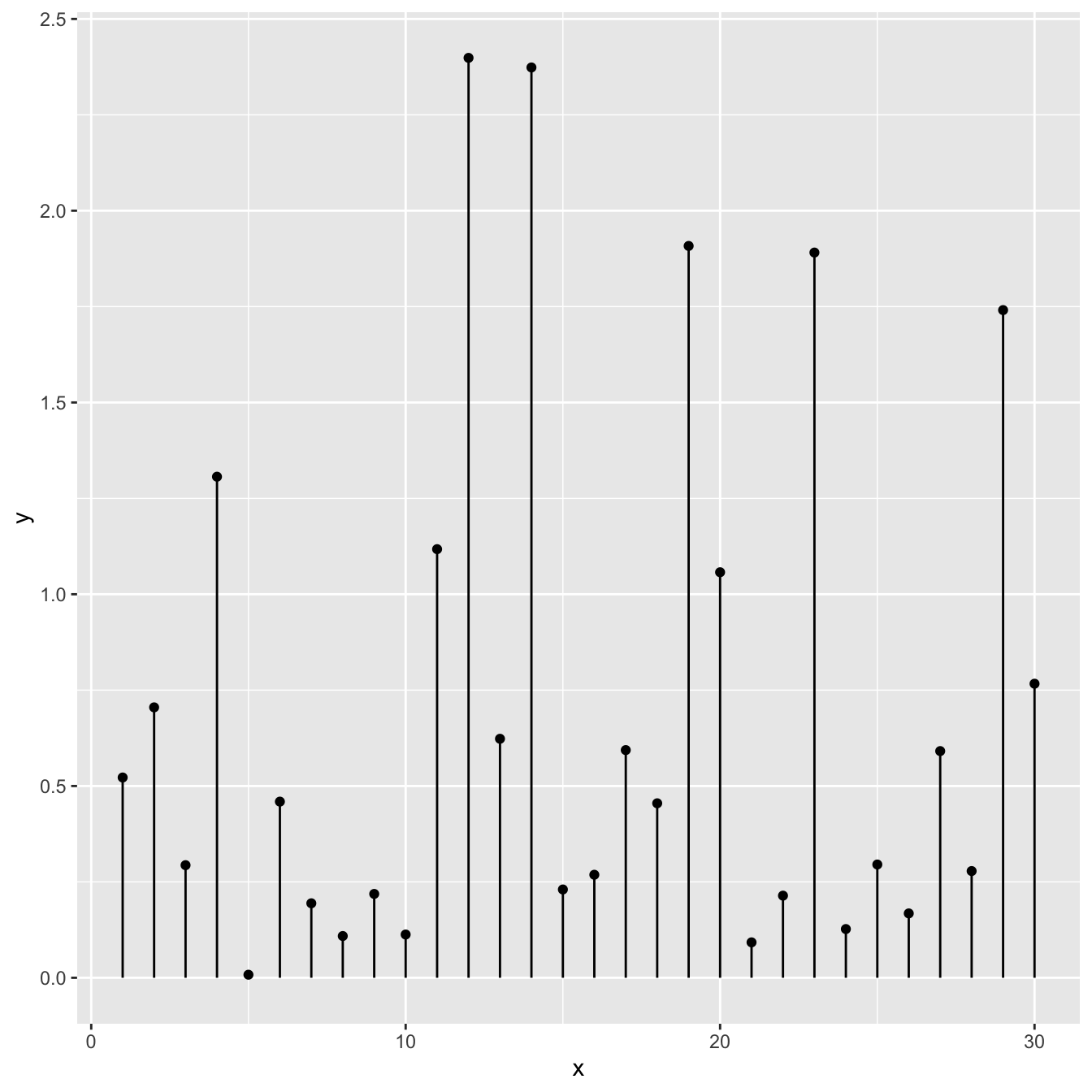
Thus, 2 types of input format work to build it:
- 2 numeric values like for a scatterplot
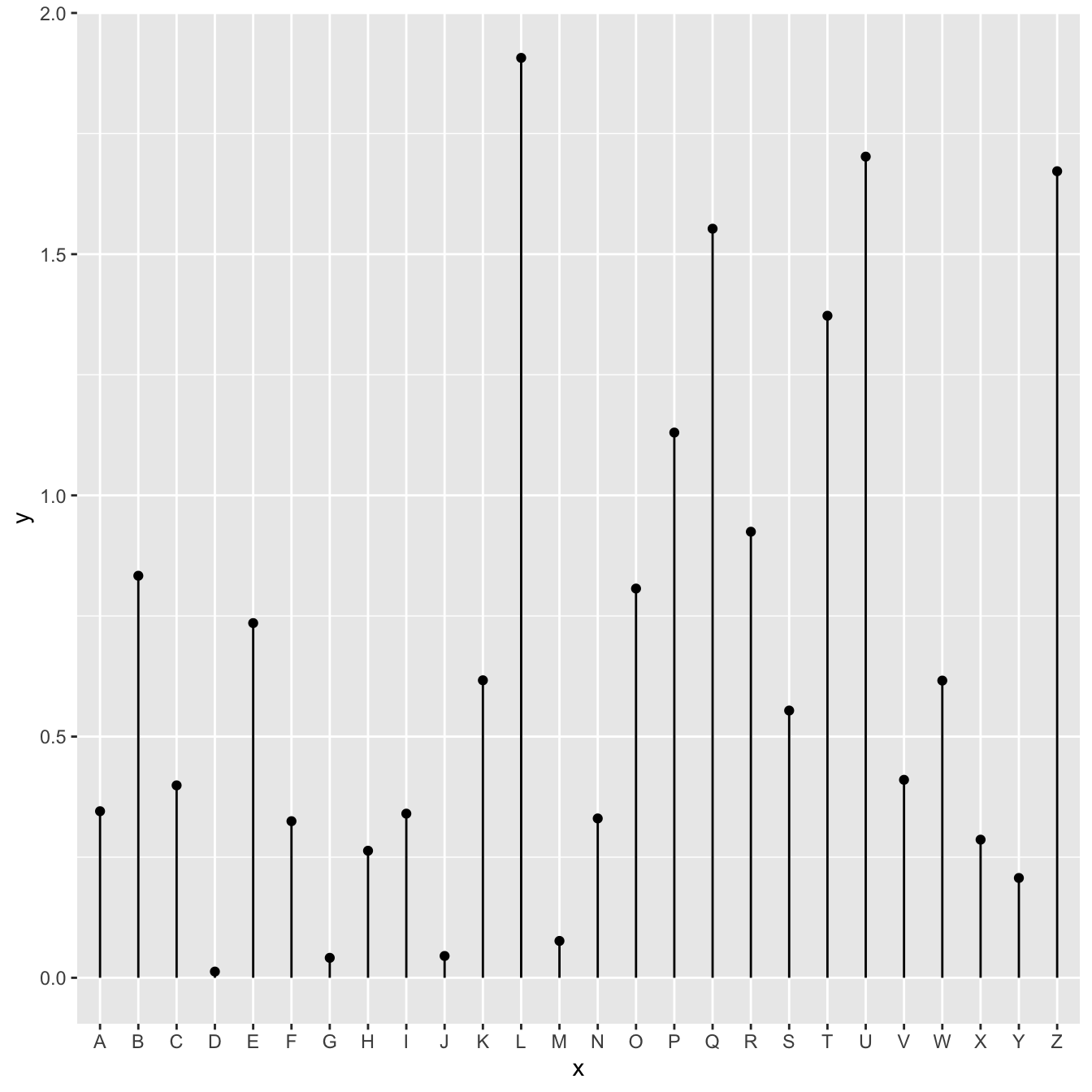
- one numeric and one categorical variable like for the barplot.
In any case, a lollipop is built using geom_point() for the circle, and geom_segment() for the stem.

# Libraries
library(ggplot2)

# Create data
data <- data.frame(x=seq(1,30), y=abs(rnorm(30)))

# Plot
ggplot(data, aes(x=x, y=y)) +
  geom_point() +
  geom_segment( aes(x=x, xend=x, y=0, yend=y))
From 1 numeric and 1 categorical variable
The code works pretty much the same way, but it is important to note that the X axis can represent a categorical variable as well. In this case, the lollipop chart is a good replacement of the barplot.

# Libraries
library(ggplot2)

# Create data
data <- data.frame(
  x=LETTERS[1:26],
  y=abs(rnorm(26))
)

# Plot
ggplot(data, aes(x=x, y=y)) +
  geom_point() +
  geom_segment( aes(x=x, xend=x, y=0, yend=y))
What’s next
The lollipop chart is one of my favourite. There is so much to do with it and it is under-utilized in favor of barplot. Visit the dedicated section for more examples produced with R, or data-to-viz to learn about the available variations and caveats to avoid.


