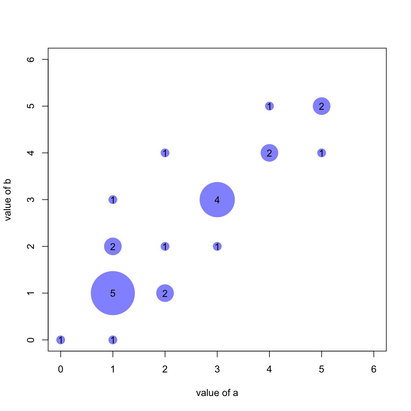
Scatterplot with variable size
An usual scatterplot would suffer overplotting when used for discrete variables: dots would be drawn on top of each other, making the chart unreadable.
The workaround suggested here makes dot size proportional to the number of datapoints behind it. On top of that, the exact number can be represented in the bubble thanks to the text() function.

#Let's create 2 discrete variables
a <- c(1,1,3,4,5,5,1,1,2,3,4,1,3,2,1,1,5,1,4,3,2,3,1,0,2)
b <- c(1,2,3,5,5,5,2,1,1,3,4,3,3,4,1,1,4,1,4,2,2,3,0,0,1)

#I count the occurence of each couple of values. Eg : number of time a=1 and b=1, number of time a=1 and b=2 etc...
AA <- xyTable(a,b)

#Now I can plot this ! I represent the dots as big as the couple occurs often
coeff_bigger <- 2
plot(AA$x , AA$y , cex=AA$number*coeff_bigger  , pch=16 , col=rgb(0,0,1,0.5) , xlab= "value of a" , ylab="value of b" , xlim=c(0,6) , ylim=c(0,6) )
text(AA$x , AA$y , AA$number )

#Note : It's easy to make a function that will compute this kind of plot automaticaly :
represent_discrete_variable <- function(var1, var2 , coeff_bigger){
  AA=xyTable(var1,var2)
  plot(AA$x , AA$y , cex=AA$number*coeff_bigger  , pch=16 , col="chocolate1" , xlab= "value of a" , ylab="value of b" )
  text (AA$x , AA$y , AA$number )
}
Other workarounds
Other workarounds could be considered in this situation:
- Heatmap
- 2d density chart
- Jittering
- Boxplot


