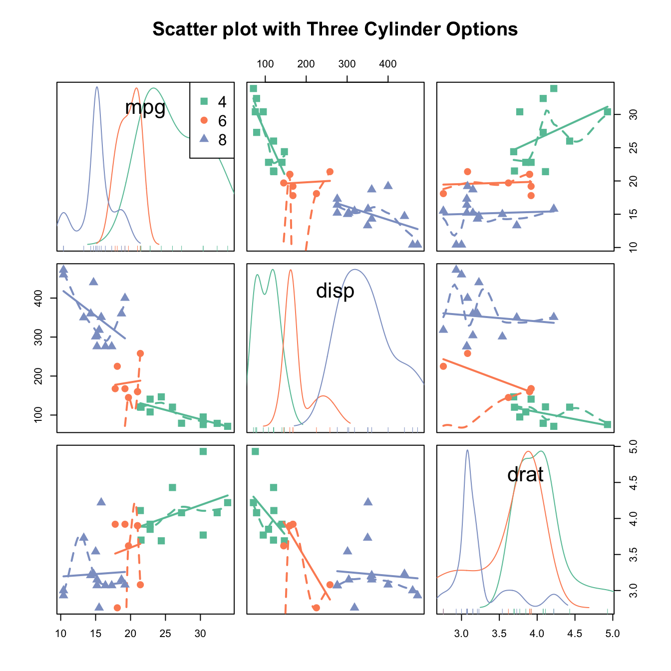
Scatterplot matrix with the native plot() function
This is a scatterplot matrix built with the scatterplotMatrix() function of the car package.
See more correlogram examples in the dedicated section.
Note the |cyl syntax: it means that categories available in the cyl variable must be represented distinctly (color, shape, size..).

# Packages
library(car)
library(RColorBrewer) # for the color palette

# Let's use the car dataset natively available in R
data <- mtcars

# Make the plot
my_colors <- brewer.pal(nlevels(as.factor(data$cyl)), "Set2")
scatterplotMatrix(~mpg+disp+drat|cyl, data=data ,
      reg.line="" , smoother="", col=my_colors ,
      smoother.args=list(col="grey") , cex=1.5 ,
      pch=c(15,16,17) ,
      main="Scatter plot with Three Cylinder Options"
      )


