Goal and Packages
At the end of this tutorial, you should get a gif file containing the following animation.
Before we start, make sure you’ve got the following libraries:
# Please Ignore, specific to a bug in the gallery
library(pacman)
pacman::p_unload(pacman::p_loaded(), character.only = TRUE)

# Load libraries
library(dplyr)        # data wrangling
library(cartogram)    # for the cartogram
library(ggplot2)      # to realize the plots
library(broom)        # from geospatial format to data frame
library(tweenr)       # to create transition dataframe between 2 states
library(gganimate)    # To realize the animation
library(maptools)     # world boundaries coordinates
library(viridis)      # for a nice color palette
A basic map of Africa
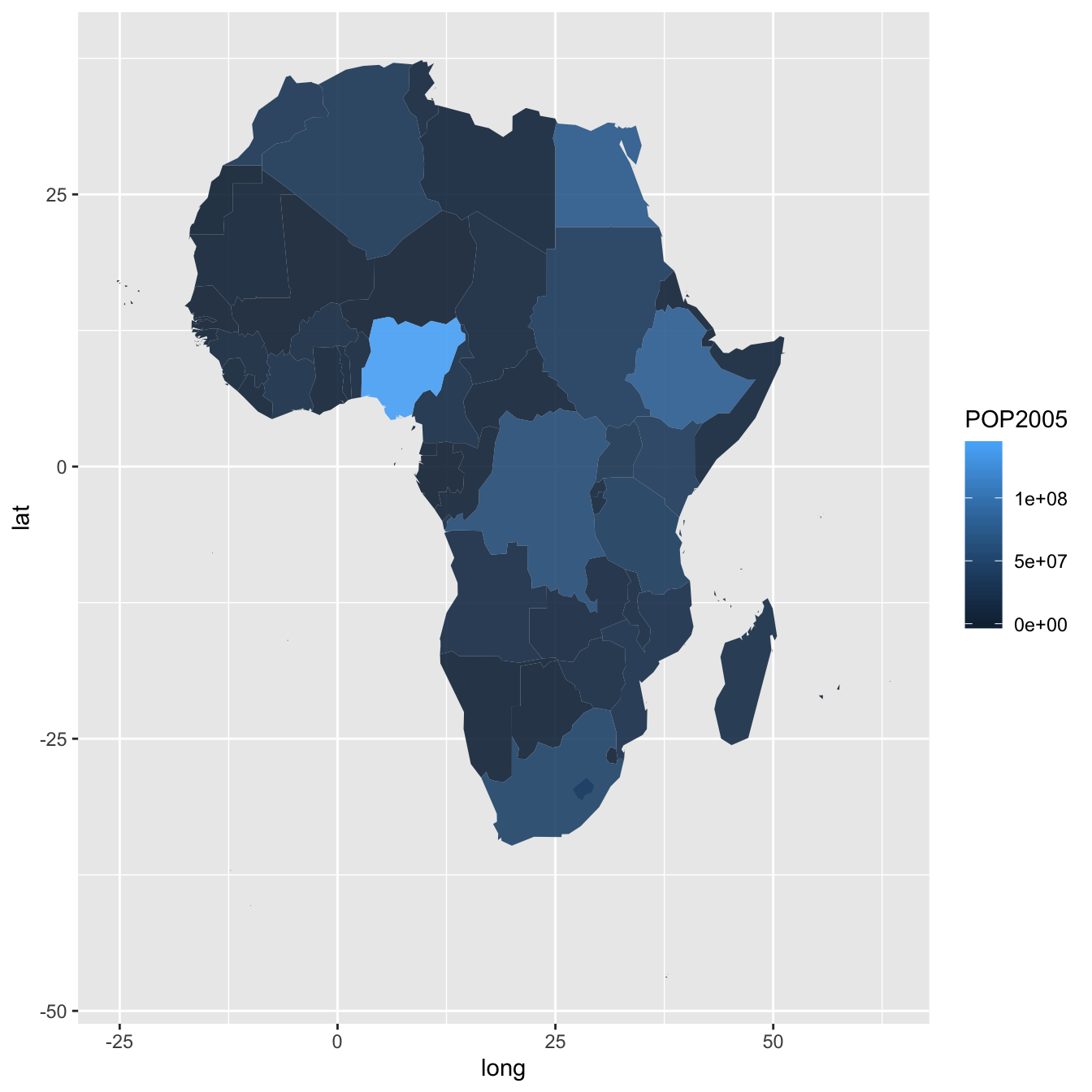
The maptools library provides all the information we need to draw a map of Africa.
All the country boundaries are stored in the world_simpl object. Let’s load this object, keep only Africa, and draw a basic representation. This requires only 3 lines of code.
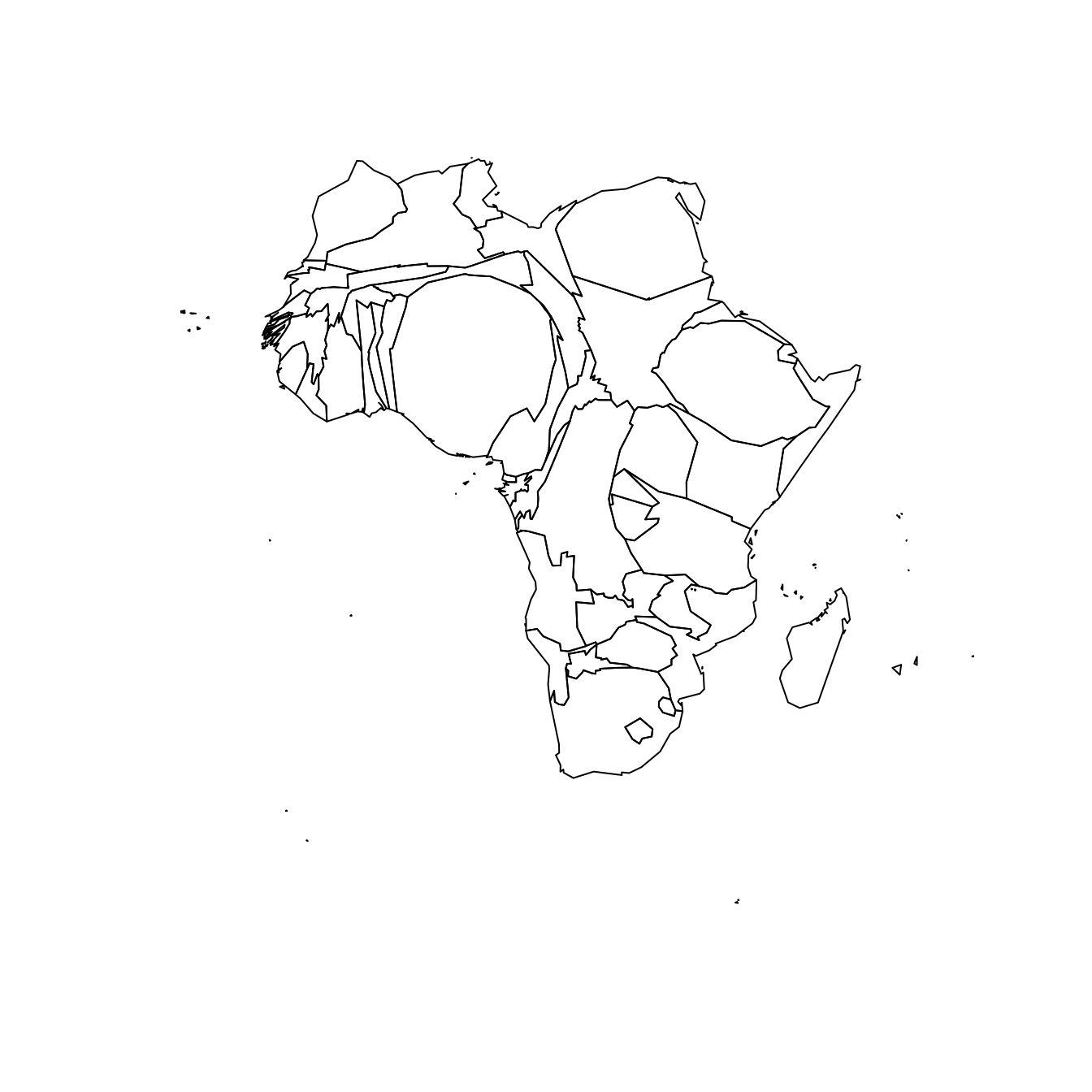
Compute cartogram boundaries
The afr object is a spatial object. Thus it has a data slot that gives a few information concerning each region. You can visualise this info typing afr@data in our case.
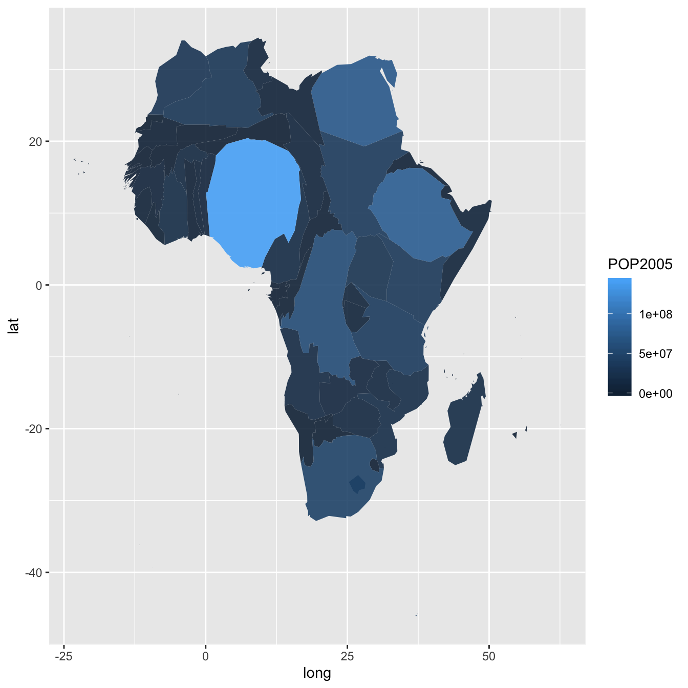
You will see a column called POP2005, providing the number of inhabitants per country in 2005.
Using this information we can use the cartogram library to build… a cartogram! Basically, it will distort the shape of every country proportionally to its number of inhabitants.
The output is a new geospatial object that we can map like we’ve done before. As you can see, Nigeria appears way bigger on this map, since it has a population of about 141M inhabitants.
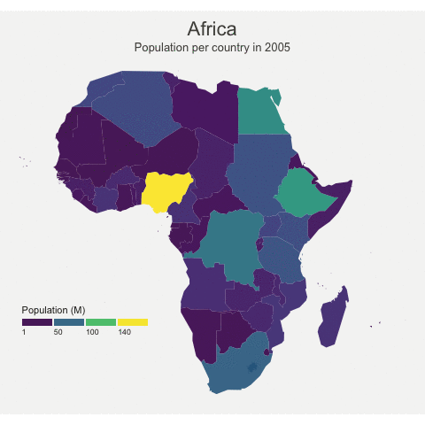
A nicer representation using ggplot2
Let’s improve the appearance of the previous maps using the ggplot2 library.
Note that ggplot2 uses data frame and not geospatial object. The transformation to a data frame is done using the tidy() function of the broom package. Since it does not transfer the data slot automatically, we merge it afterward.
The geom_polygon() function is used to draw map data. See the graph #327 of the gallery for more explanation on choropleth maps with ggplot2.

# Transform these 2 objects in dataframe, plotable with ggplot2
afr_cartogram_df <- tidy(afr_cartogram) %>% left_join(. , afr_cartogram@data, by=c("id"="ISO3"))
afr_df <- tidy(afr) %>% left_join(. , afr@data, by=c("id"="ISO3"))

# And using the advices of chart #331 we can custom it to get a better result:
ggplot() +
  geom_polygon(data = afr_df, aes(fill = POP2005/1000000, x = long, y = lat, group = group) , size=0, alpha=0.9) +
  theme_void() +
  scale_fill_viridis(name="Population (M)", breaks=c(1,50,100, 140), guide = guide_legend( keyheight = unit(3, units = "mm"), keywidth=unit(12, units = "mm"), label.position = "bottom", title.position = 'top', nrow=1)) +
  labs( title = "Africa", subtitle="Population per country in 2005" ) +
  ylim(-35,35) +
  theme(
    text = element_text(color = "#22211d"),
    plot.background = element_rect(fill = "#f5f5f4", color = NA),
    panel.background = element_rect(fill = "#f5f5f4", color = NA),
    legend.background = element_rect(fill = "#f5f5f4", color = NA),
    plot.title = element_text(size= 22, hjust=0.5, color = "#4e4d47", margin = margin(b = -0.1, t = 0.4, l = 2, unit = "cm")),
    plot.subtitle = element_text(size= 13, hjust=0.5, color = "#4e4d47", margin = margin(b = -0.1, t = 0.4, l = 2, unit = "cm")),
    legend.position = c(0.2, 0.26)
  ) +
  coord_map()

# You can do the same for afr_cartogram_df
Compute several intermediate maps

The goal being to make a smooth animation between the 2 maps, we need to create a multitude of intermediate maps using interpolation.
This is possible thanks to the awesome tweenr library. (See a few examples in the animation section of the gallery).
At the end we’ve got a big data frame which contains enough information to draw 30 maps. Three of these maps are presented above.
# Give an id to every single point that compose the boundaries
afr_cartogram_df$id <- seq(1,nrow(afr_cartogram_df))
afr_df$id <- seq(1,nrow(afr_df))

# Bind both map info in a data frame. 3 states: map --> cartogram --> map
data <- rbind(afr_df, afr_cartogram_df, afr_df)

# Set transformation type + time
data$ease <- "cubic-in-out"
data$time <- rep(c(1:3), each=nrow(afr_df))

# Calculate the transition between these 2 objects?
dt <- tween_elements(data, time='time', group='id', ease='ease', nframes = 30)

# check a few frame
ggplot() +
  geom_polygon(data = dt %>% filter(.frame==0) %>% arrange(order),
    aes(fill = POP2005, x = long, y = lat, group = group), size=0, alpha=0.9
  )
ggplot() +
  geom_polygon(data = dt %>% filter(.frame==5) %>% arrange(order),
    aes(fill = POP2005, x = long, y = lat, group = group) , size=0, alpha=0.9
  )
ggplot() +
  geom_polygon(data = dt %>% filter(.frame==10) %>% arrange(order),
    aes(fill = POP2005, x = long, y = lat, group = group) , size=0, alpha=0.9
  )
Make the animation with gganimate
The last step consists at building the 30 maps and compile them in a .gif file. This is done using the gganimate library. This library uses another aesthetic: frame. A new plot is made for each frame, that allows us to build the gif afterwards.
Note: This code uses the old version of
gganimate. It needs to be updated. Please drop me a message if you can help me with that!
# Plot
p <- ggplot() +
  geom_polygon(data = dt  %>% arrange(order) , aes(fill = POP2005/1000000, x = long, y = lat, group = group, frame=.frame) , size=0, alpha=0.9) +
  theme_void() +

  scale_fill_viridis(
    name="Population (M)", breaks=c(1,50,100, 140),
    guide = guide_legend(
      keyheight = unit(3, units = "mm"), keywidth=unit(12, units = "mm"),
      label.position = "bottom", title.position = 'top', nrow=1)
  ) +
  labs( title = "Africa", subtitle="Population per country in 2005" ) +
  ylim(-35,35) +

  theme(
    text = element_text(color = "#22211d"),
    plot.background = element_rect(fill = "#f5f5f4", color = NA),
    panel.background = element_rect(fill = "#f5f5f4", color = NA),
    legend.background = element_rect(fill = "#f5f5f4", color = NA),
    plot.title = element_text(size= 22, hjust=0.5, color = "#4e4d47", margin = margin(b = -0.1, t = 0.4, l = 2, unit = "cm")),
    plot.subtitle = element_text(size= 13, hjust=0.5, color = "#4e4d47", margin = margin(b = -0.1, t = 0.4, l = 2, unit = "cm")),
    legend.position = c(0.2, 0.26)
  ) +
  coord_map()

# Make the animation
#animation::ani.options(interval = 1/9)
gganimate(p, "Animated_Africa.gif",  title_frame = F)
Done! You should have the gif in your working directory.
Conclusion
This post uses several concepts that are extensively described in the R graph gallery:
- The choropleth map section gives several examples of choropleth maps, using different input types and several tools
- The cartogram section gives further explanation about cartograms
- The animation section explains more deeply how
tweenRandgganimatework - The map section is a good starting point if you are lost in the map related packages jungle
If you are interested in dataviz, feel free to visit the gallery, or to follow me on twitter!
Related chart types