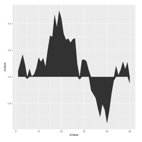
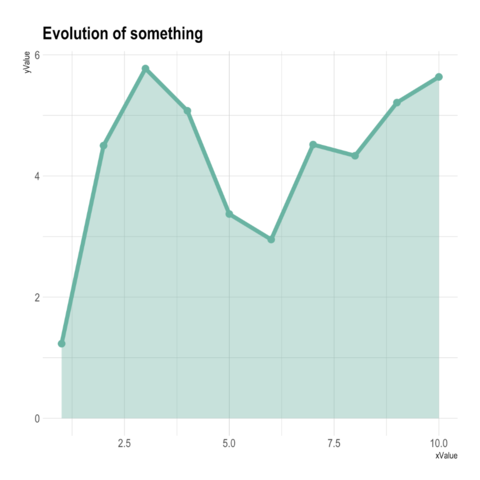
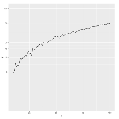
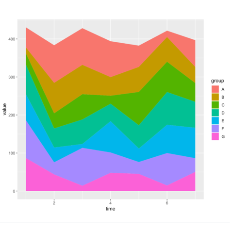
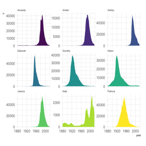
This section is tightly linked with other sections. A line chart is the same but doesn't fill the surface between the line and the X axis. A connected scatterplot is almost the same thing, but each observation is represented as a dot. More generally, the time series section can interest you.
connected scatter line chart time seriesggplot2ggplot2 allows to draw line charts thanks to the geom_line() function. It expects as input a data frame with 2 numeric variables, one displayed on each axis. Start your journey with the most basic line chart.
plotlyThe ggplotly() function of the plotly library makes it a breeze to build an interactive version. Try to hover circles to get a tooltip, or select an area of interest for zooming. Double click to reinitialize.
dygraphThe dygraph package is dedicated to time series visualization. It offers zooming, hovering, minimaps and much more. Visit the time series section that is dedicated to it for more.
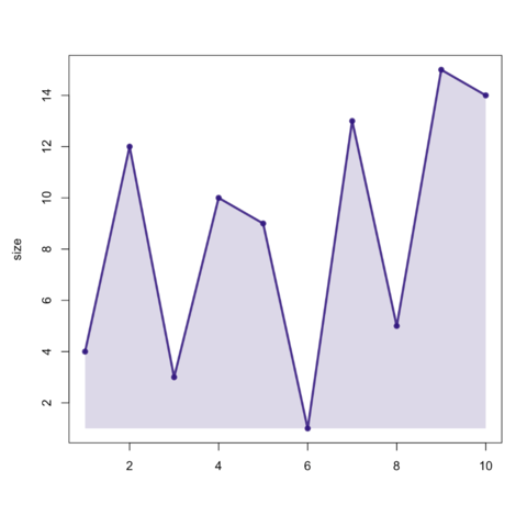
In base R, the combination of the plot() and the polygon() functions allows to build quality area charts.
