Using ggplot2
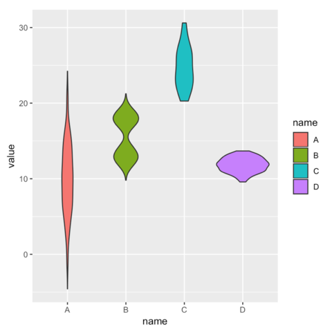
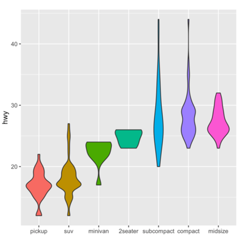
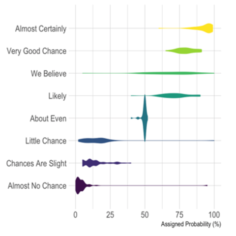
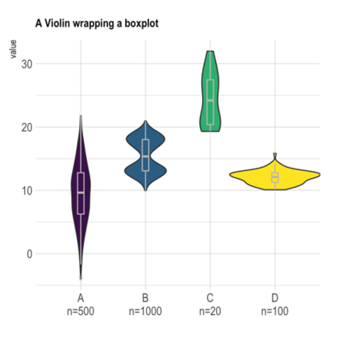
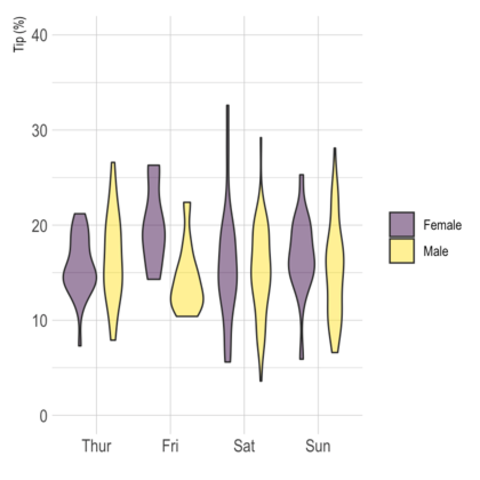
Violin charts can be produced with ggplot2 thanks to the geom_violin() function. The first chart of the sery below describes its basic utilization and explain how to build violin chart from different input format.
Using base R
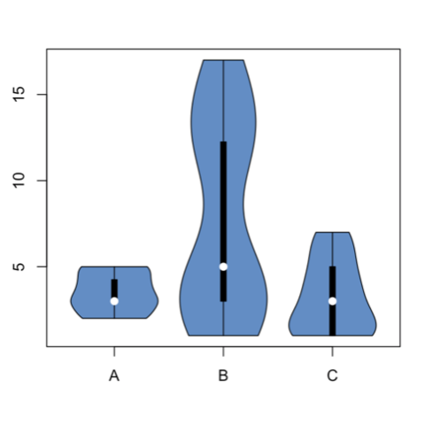
It is doable to plot a violin chart using base R and the Vioplot library..
